


Brand Identity & Logo Design for Urban
Urban is a forward-thinking grocery brand identity that redefines what modern retail looks and feels like. Centered around a robotic arm symbol, the logo embodies automation, precision, and progress, representing technology seamlessly integrated into daily life. The geometric letterforms and minimal teal-and-white palette create a clean, intelligent aesthetic that communicates trust and innovation. Every design element from typography to iconography was built for adaptability, ensuring consistency across digital and physical spaces. More than a logo, Urban is a visual statement about efficiency and creativity in motion. It challenges the expectations of the grocery industry, positioning the brand as a pioneer, and shaping the future of smart retail.

Primary & Secondary Logo:


Mark Version:


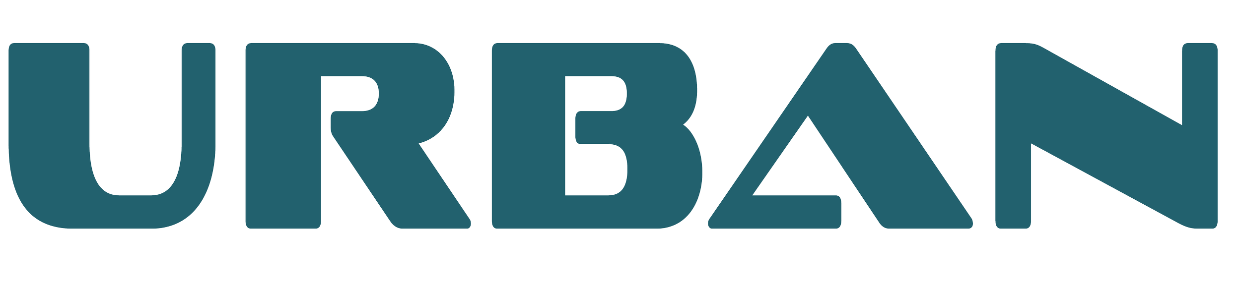
Word Mark
-
![]()
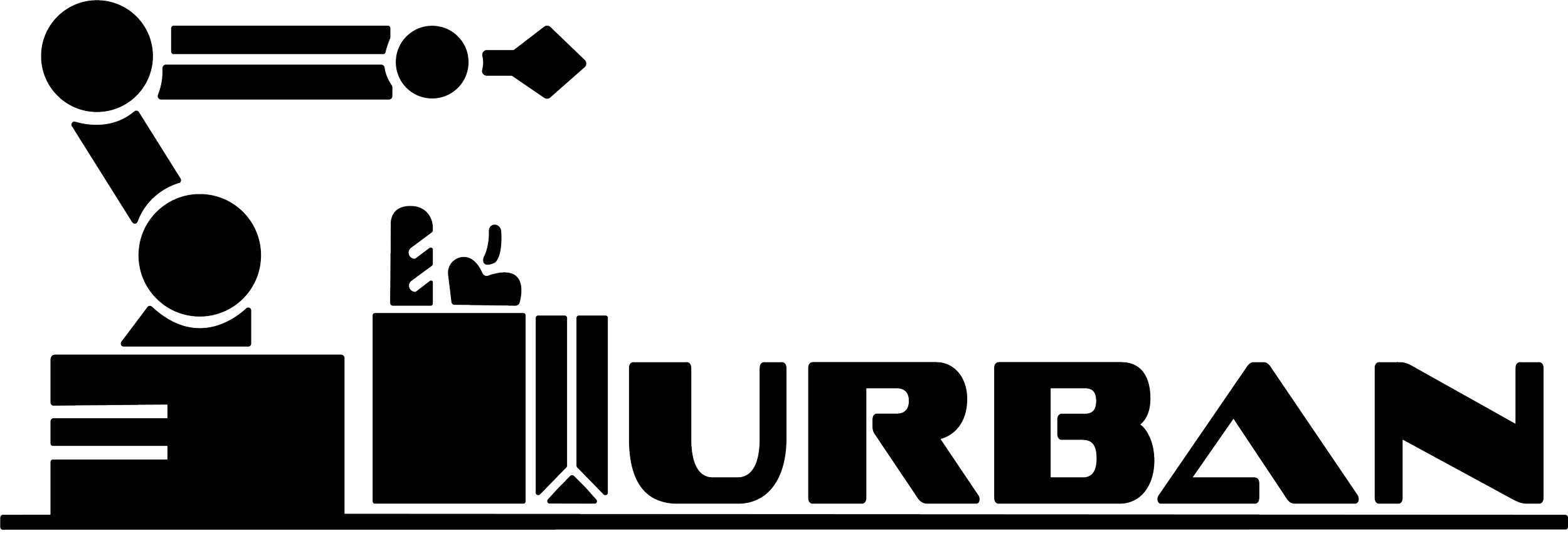
Word Mark Print Black
-
![]()
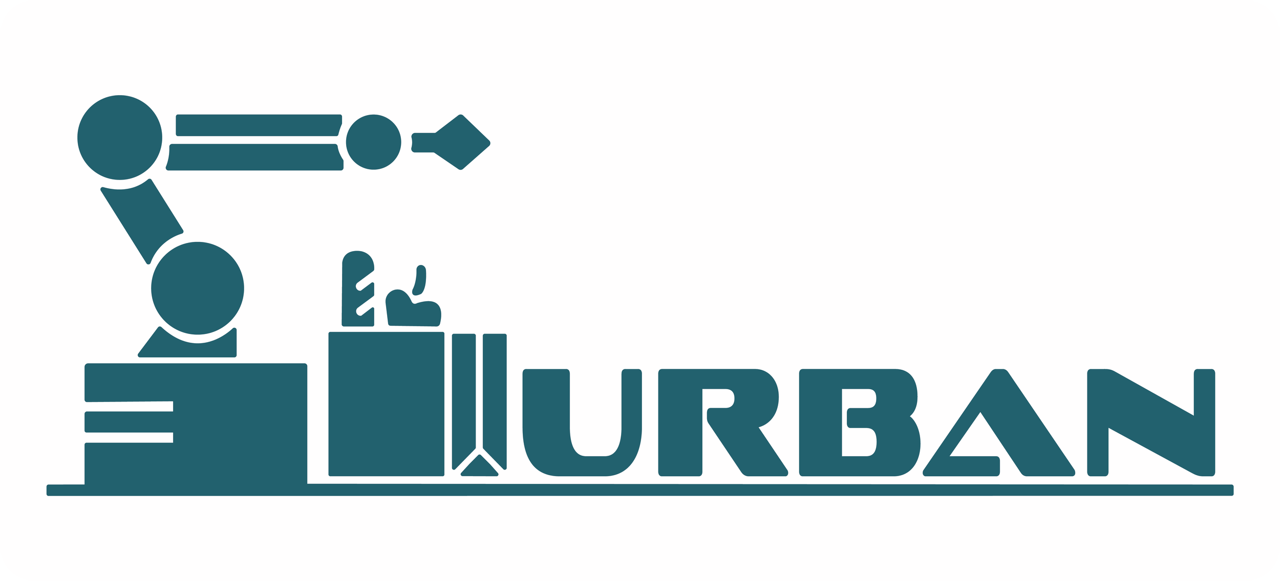
Word Mark Print Full Inverse
-
![]()
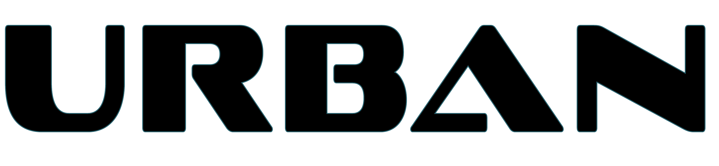
Word Mark Print White

Logo Usage:
Core Colors:

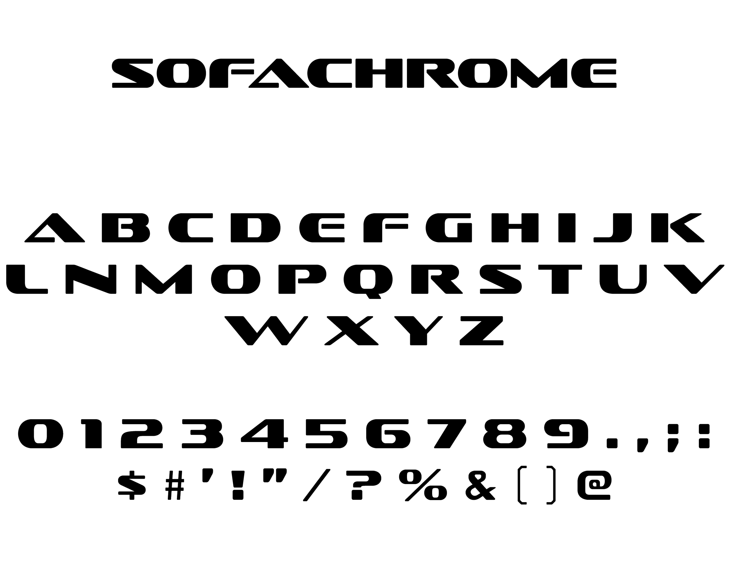
Typography:

Icons:
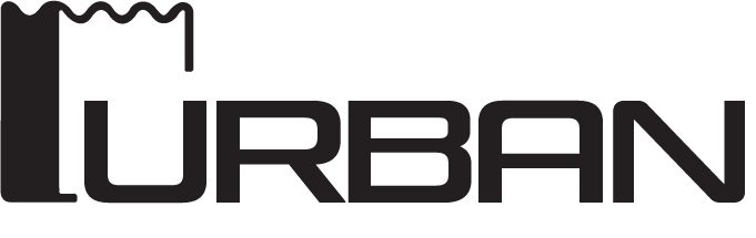
Secondary Logo:


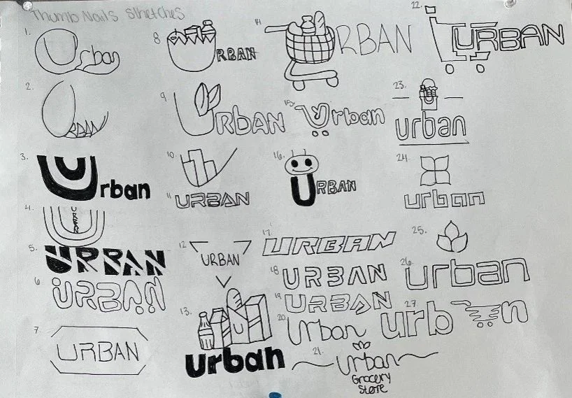
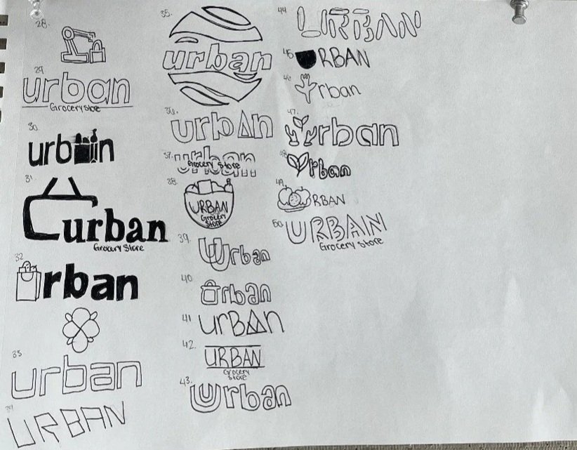
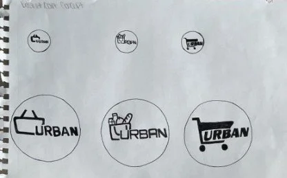
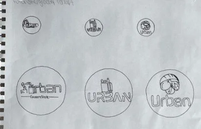
Mood Board’s & Sketches
-
![]()
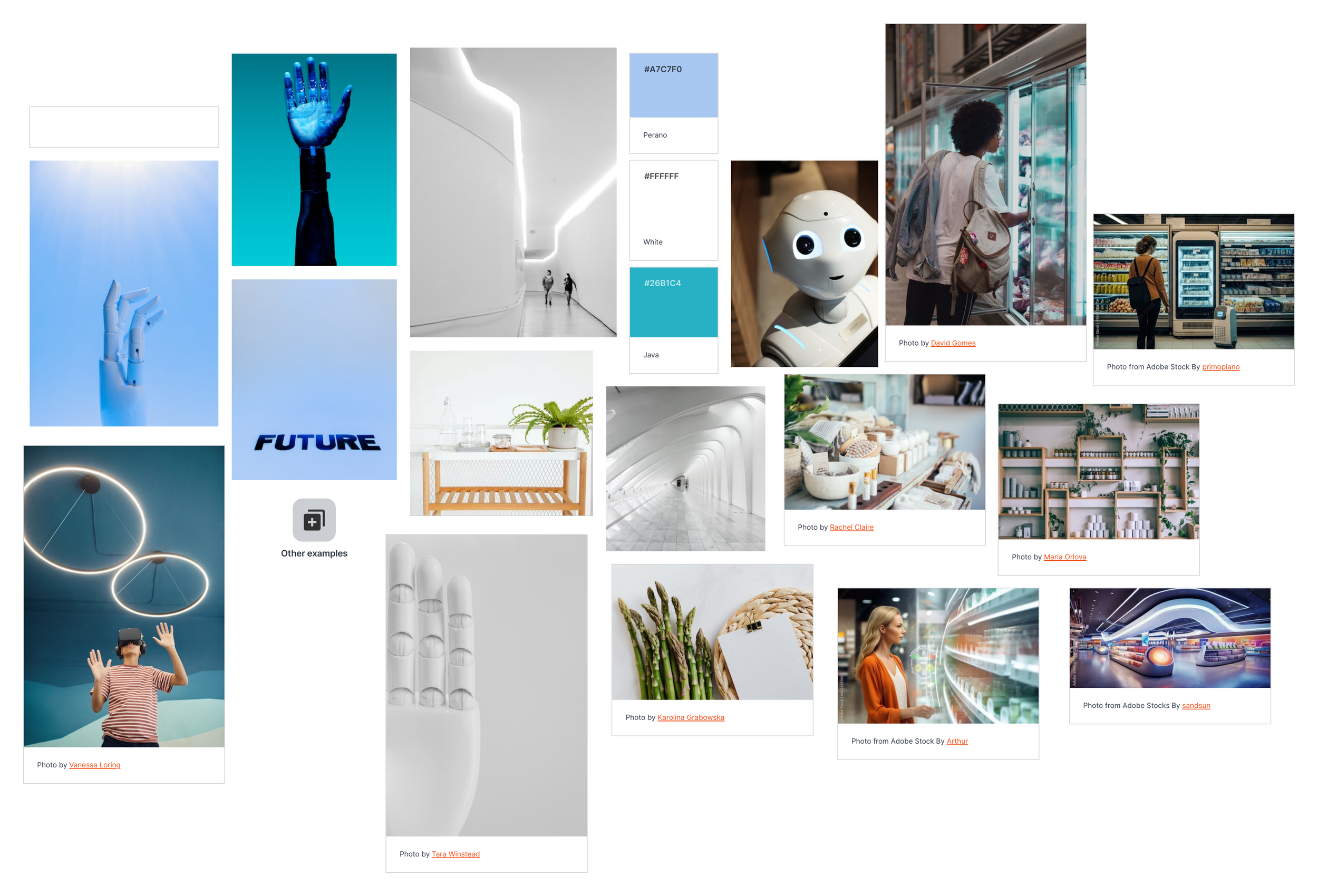
Final Mood Board
-
![]()
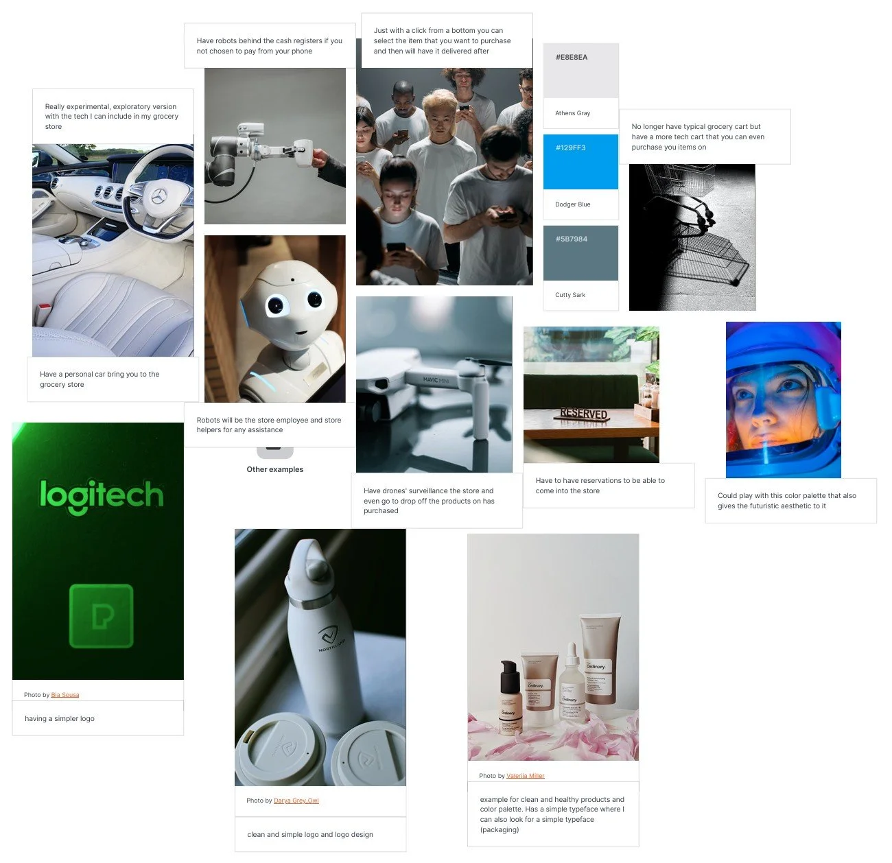
Experimental Mood Board
-
![]()
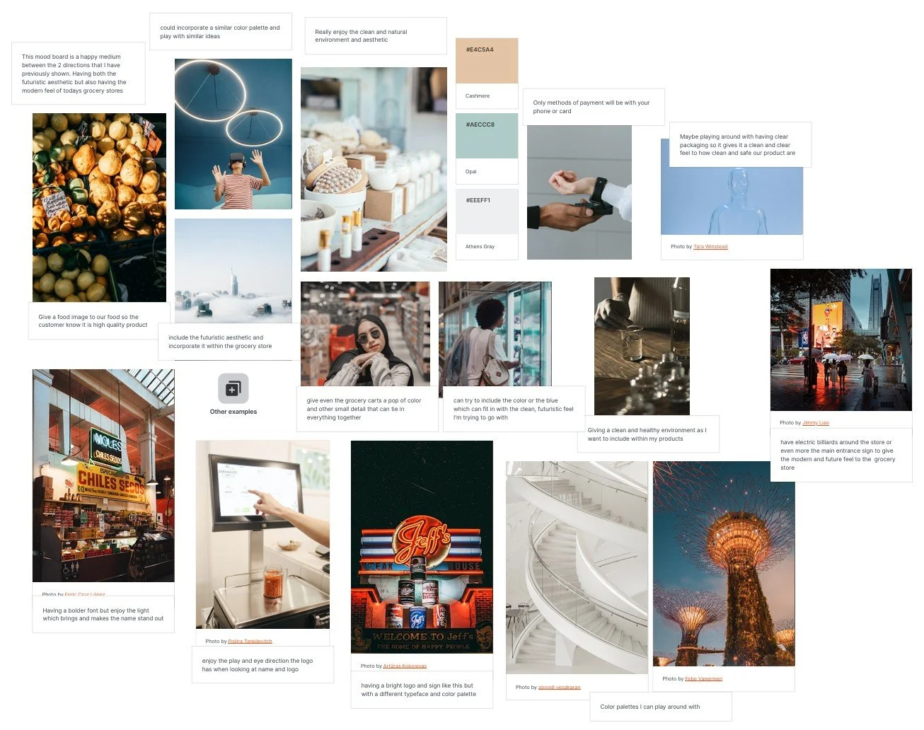
Happy/Medium Mood Board
-
![]()
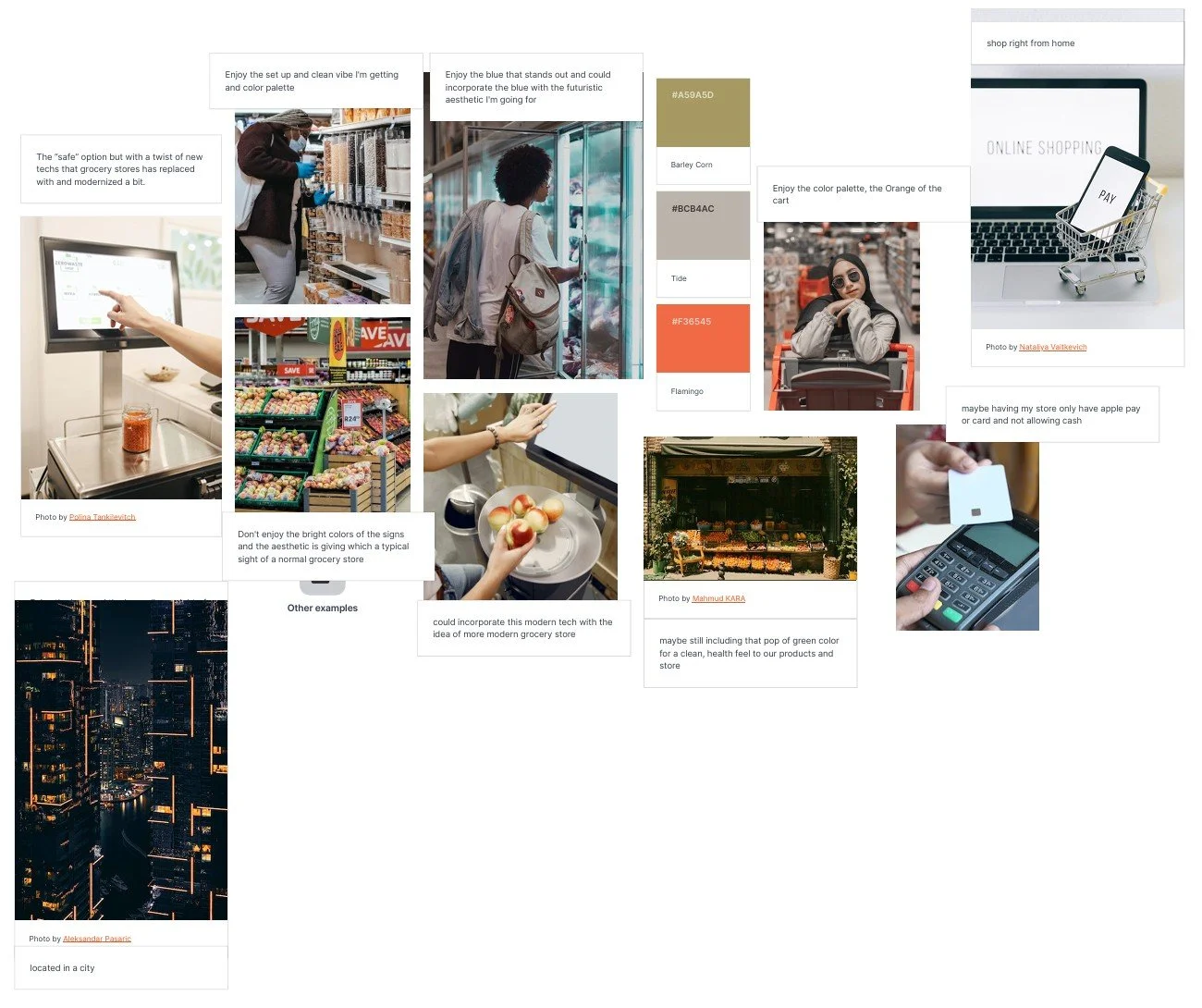
Safe Mood Board
-
![]()
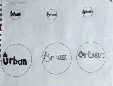
Sketches
-
![]()
Sketches
-
![]()
Sketches
-
![]()
Sketches
-
![]()
Sketches
Vision Statement: To redesign the works of a typical grocery store.
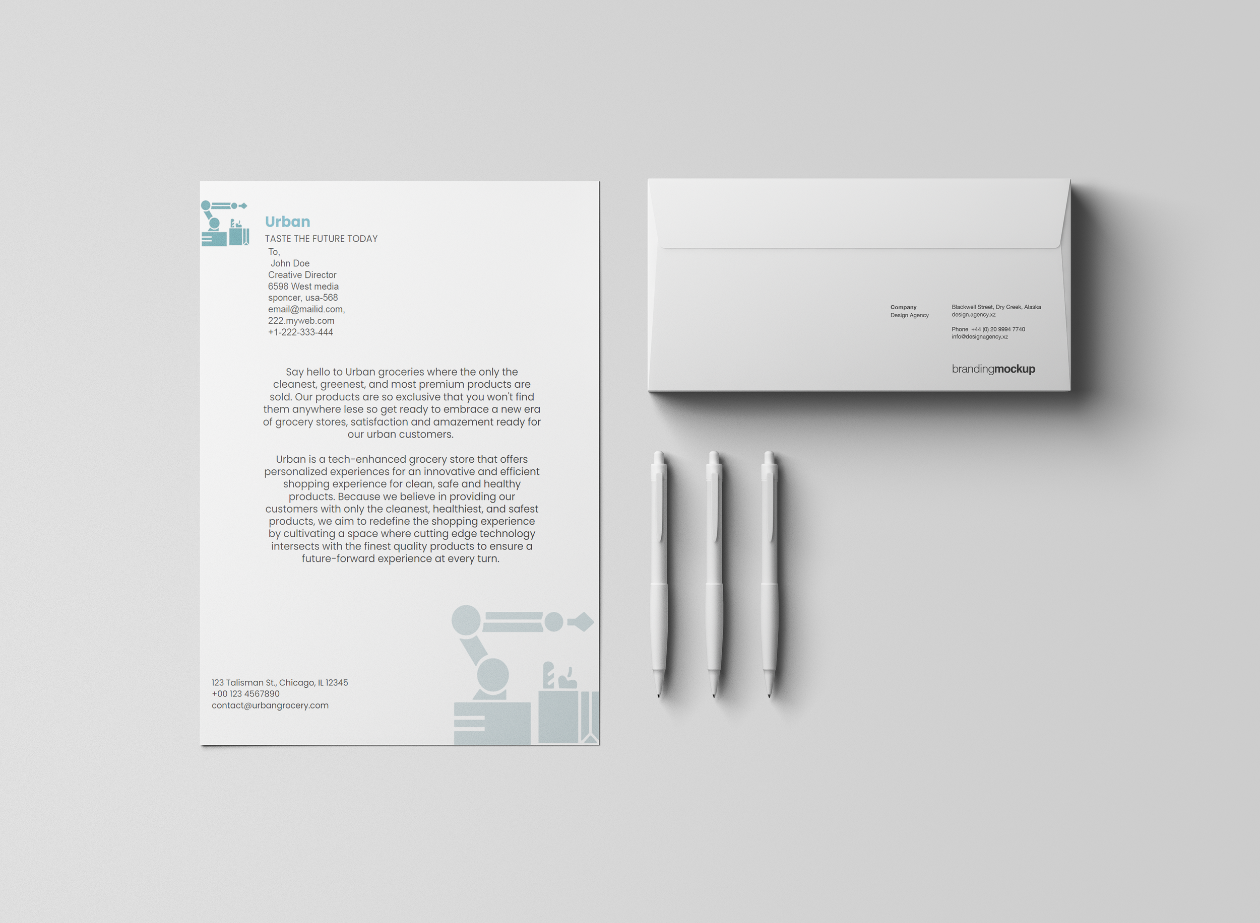
Mission Statement: Say Hello to Urban, where only the cleanest, greenest, and mot premium products are sold. Our products are so exclusive that you won’t find them anywhere else do get, so get ready to embrace a new era of grocery stores, satisfaction and amazement ready for our urban grocery store.
Brand Foundation Statement: Because we believe in providing our customers with only the cleanest, healthiest, and safest products, we aim to refine the shopping experience by cultivating a space where cutting edge technology intersects with the finest quality products to ensure a future-forward.
Tagline: “Taste the future today”
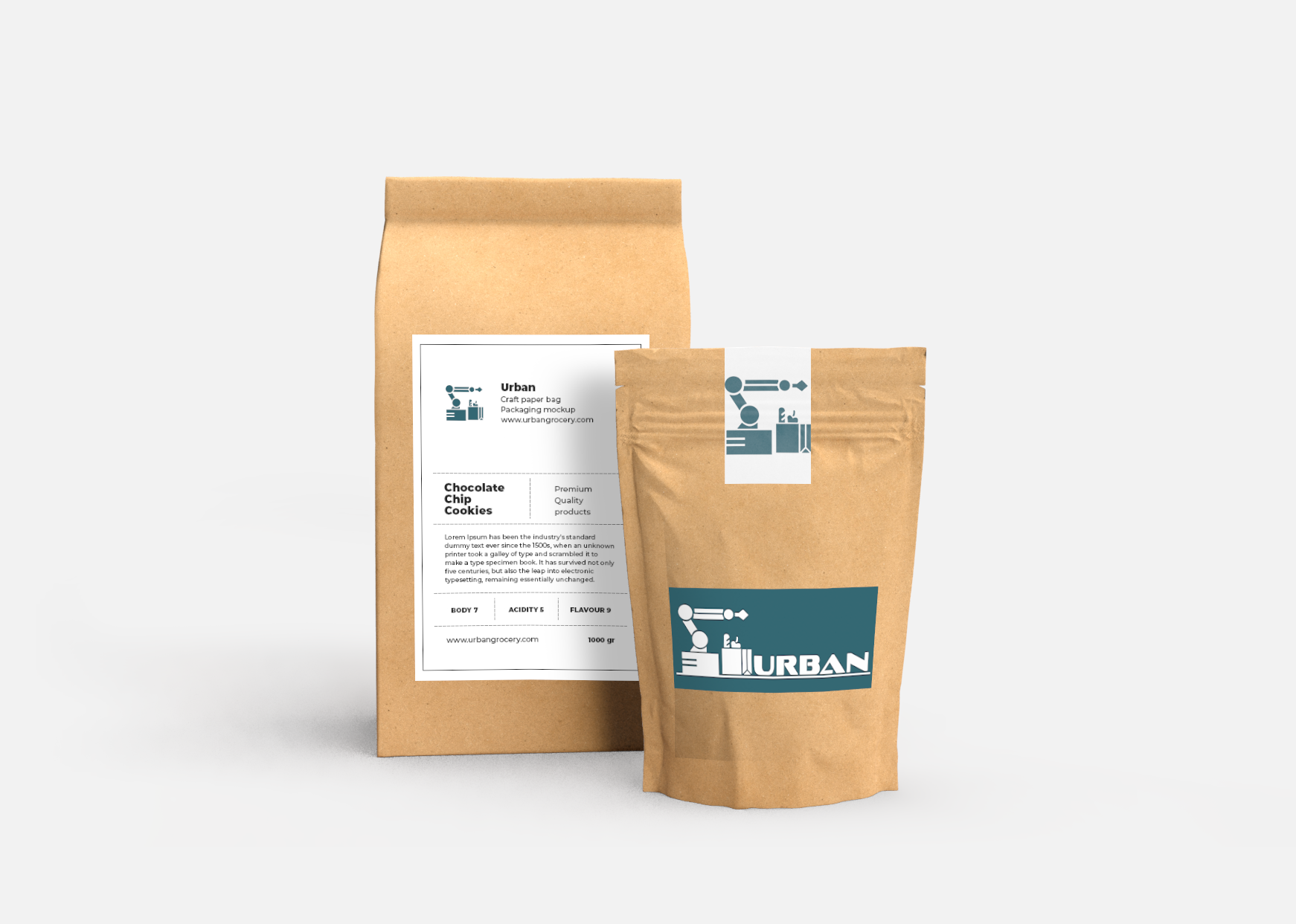
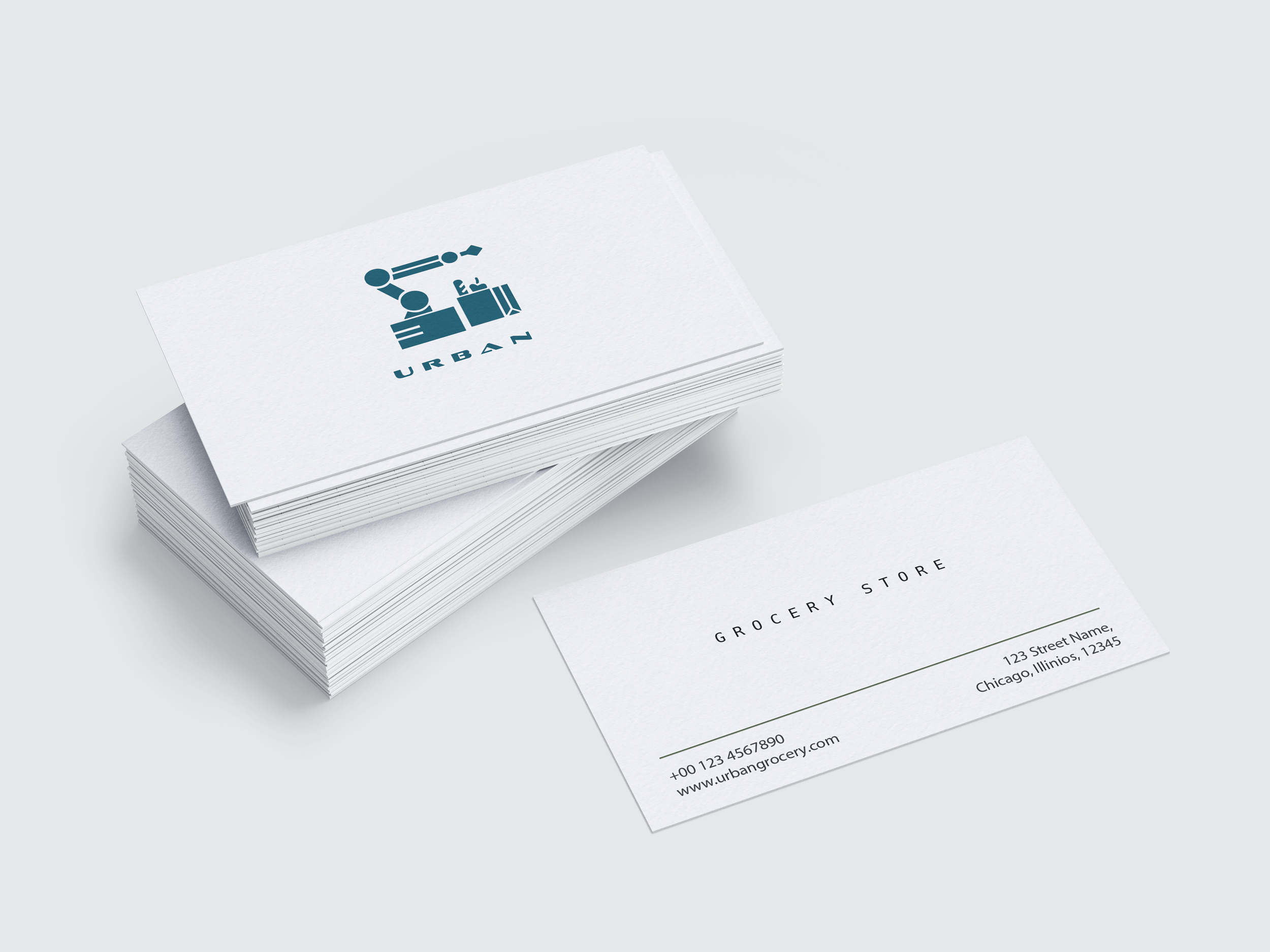
Urban is a forward-thinking grocery brand identity created to challenge and redefine what a modern grocery store looks and feels like. At the core of the visual system is a robotic arm symbol, representing automation, precision, and progress technology seamlessly integrated into everyday life. This symbol sets the tone for a brand that embraces innovation while maintaining clarity and purpose.
The logo design features geometric letterforms paired with a minimal teal-and-white color palette, establishing a clean, intelligent, and trustworthy aesthetic. Every design choice from typography to iconography was intentionally developed for flexibility and adaptability, allowing the identity to remain consistent across both digital and physical environments.
Guided by the vision to redesign the traditional grocery experience, Urban positions itself as a pioneer in smart retail. The mission focuses on offering the cleanest, greenest, and most premium products, so exclusive they can’t be found anywhere else. The brand foundation reinforces this commitment by blending cutting-edge technology with high-quality, health-focused products to create a refined, future-forward shopping experience.
More than just a logo, Urban is a bold visual statement about efficiency, creativity, and innovation in motion, inviting customers to truly “Taste the future today.”